Jenné's headshot

Hi! I'm Jenné

and I think design systems are pretty neat!

While I have a background as a design generalist—print, web, social, code, you name it—these days I'm all about design systems. I love building beautiful Figma components, obsessing over the smallest of edge cases, writing helpful documentation and making sure everything I build is accessible.

When I'm not heads down in Figma, you can find me chillaxing at my favorite SF coffee shops, making ceramics at my local studio, or taking way too many photos of my cat.

Keep scrolling for some selected highlights of my work. Want to learn even more?? Let's connect!

Phi

Sigma's design system

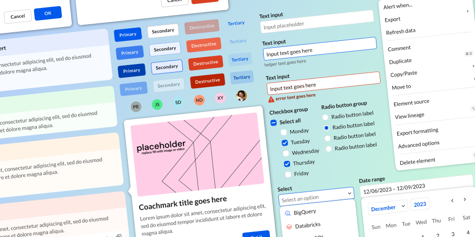
The majority of my time at Sigma was spent designing, maintaining, and scaling our design system, which we dubbed Phi.

Phi has all of the hallmarks of a strong system—cohesion, flexibility, scalability, and accessibility. Uniquely, Phi was built to be fully user-themeable, since many of Sigma's customers embedded our product within their own environments..

Take a look at the Phi Figma library here to see it in action ↠

A few example components from the Phi system displayed at an angle over a blue-green gradient background

UployBot

Giving our internal tools a much needed facelift

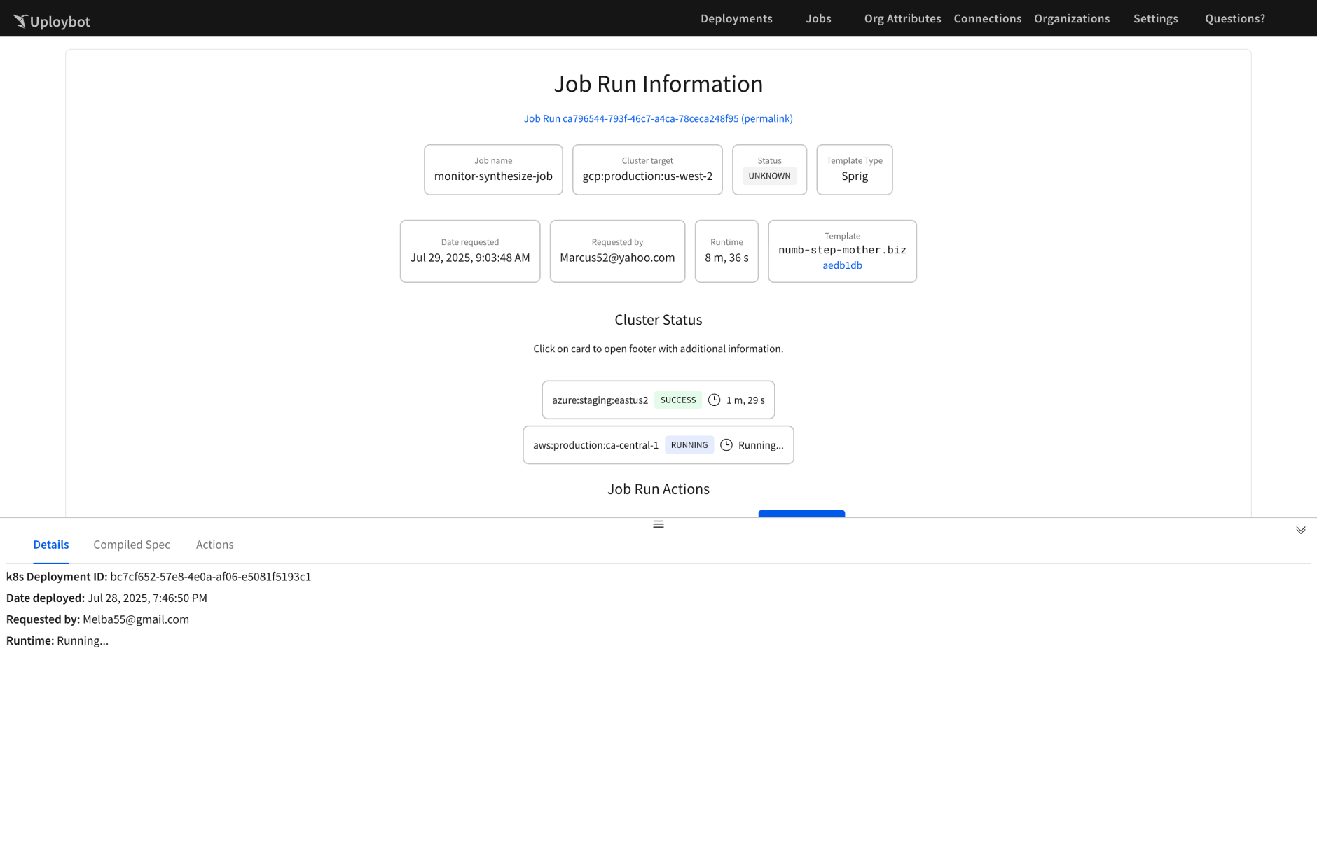
Poor little UployBot. Originally just a tool to release code to production, it slowly gained more and more features over the years, without ever getting a once-over from a designer.

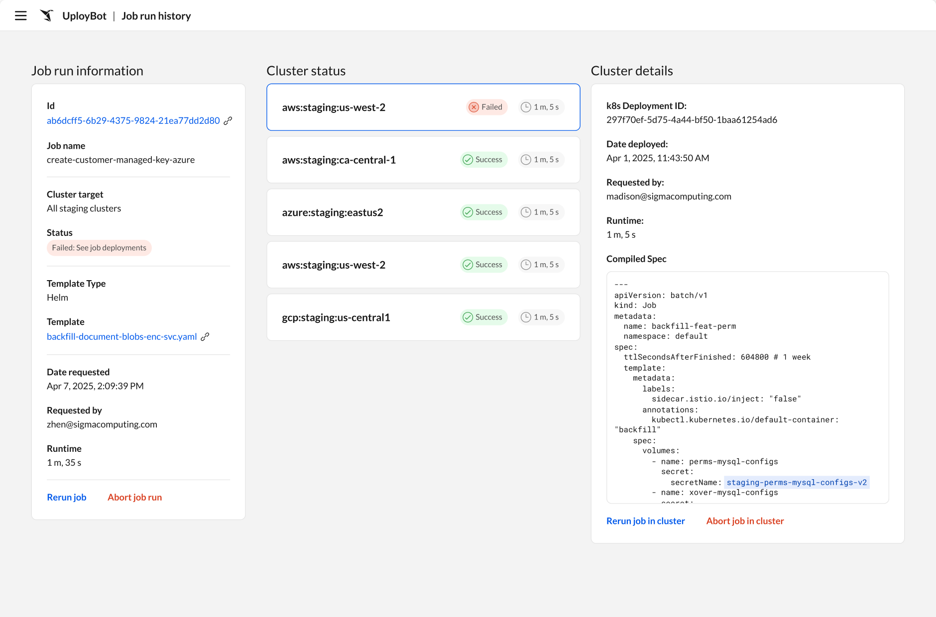
My engineering team finally got fed up with the state of UployBot and tapped me to lead a full redesign using Phi. To say it was a success would be an understatement. Engineers across the company loved the visual polish and streamlined workflows. The update also served as a strong proof of concept for how easy it was to migrate code to Phi.

A screenshot of the Job run information screen before I redesigned it Before
A screenshot of the Job run information screen after I redesigned it After

Project: Perspective

What if…we could make Workbook theming painless?

When our new VP of Design started, he kicked off a skunkworks project to redesign the Workbooks UI, codenamed Horizon. He then tasked me, as the resident color expert, with reimagining the theming experience, which we codenamed Perspective (get it?).

The goal was to streamline theming and reduce the analysis paralysis many less design-savvy users felt when faced with a broad suite of options. You can try out the prototype below and see if you agree.

Juice

No, not that kind of juice

For Sigma's 2024 Summer Hackathon, I gave a lightning talk on "juice", the art of adding a little extra oomph to interactive designs.

(This was right after Sigma's rebrand, so I took the opportunity to show off how playful and energetic the new brand could be for our engineers.)

Figma Template

Design ops, my beloved

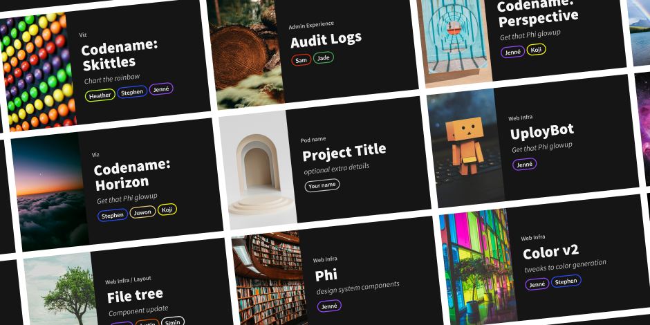
The design team's file hygiene was notoriously poor, making it difficult to onboard new designers and ensure engineers wrote clean code. To help, I created a new Figma template with sample layouts, workflow diagrams and a stickersheet of commonly used components.

Take a peek at the template here ↠

A grid of Figma thumbnails that were created using the resources in the project template